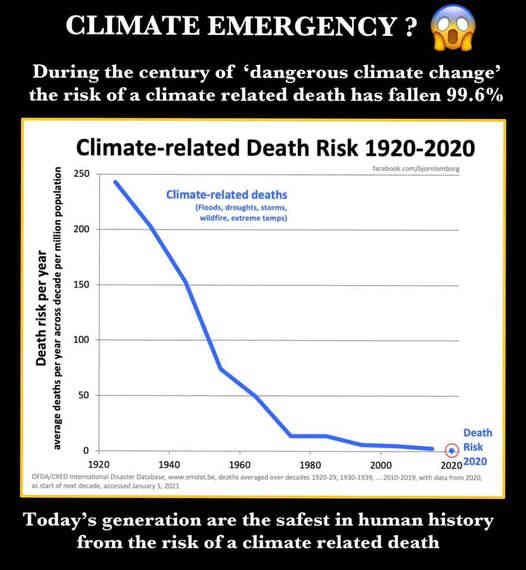
On 5 January Craig Kelly posted a graph showing a large fall in climate-related fatalities over the period 1920-2020. He used this to question climate science, but his post illustrates four ways NOT to use data.
In brief
It is true that deaths caused by climate-related disasters have trended downwards in the past century. But Mr Kelly’s post misrepresents the facts in four ways:
- He hasn’t used all the data, and so overstates the trend.
- The data hasn’t been analysed properly, so he doesn’t show its uncertainty.
- The information he presents doesn’t lead to the conclusion he draws. The downward trend is mainly caused by improvements to how disasters are managed.
- He ignores an enormous amount of other information that shows his climate change scepticism is mistaken.
Read on for the analysis.
The claim
Mr Kelly’s post was critical of the “Climate Emergency” which he regards as lies by “climate alarmist, socialists, UN Globalists and green rent-seekers”. He went on to say: “The ignorance, stupidity and anti-scientific superstitious beliefs of the Climate Cult is beyond farce.” Then he posted this graph.
How NOT to use data
Mr Kelly’s post illustrates how data can be misused, and shows the need to follow four simple “rules”.
1. Check the data
Mr Kelly doesn’t give a source for his graph. I have found several sites on the internet using the same graph, and it appears to originate with Bjorn Lomborg. (I have written about Bjorn before, and his claims about damaging and harmful climate events.)
The data in the graph clearly comes from The International Disasters Database produced by the Centre for Research on the Epidemiology of Disasters in Belgium.
The database commences in 1900 but Mr Kelly’s graph begins in 1920. There may be a good reason for this, but it is notable that the two missing decades have a significantly lower number of fatalities. When the extra two decades are included, there is still a significant fall in the number of deaths, but the trend isn’t nearly so clear.
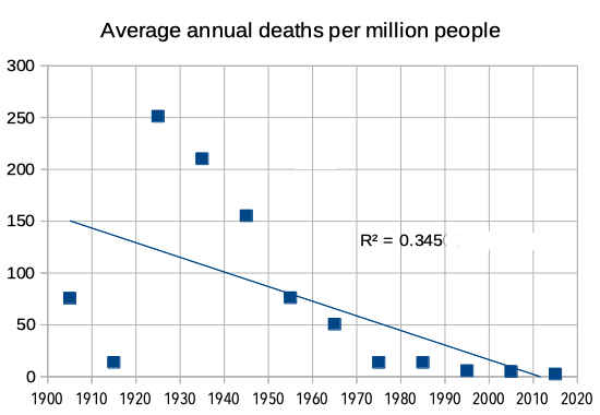
Here is the graph of the full dataset.
There is another problem with this data – it only relates to “disasters”. But many people die from climate related causes that are not classed as disasters, for example:
- hot days can kill several thousand people in Australia each year, and many of these days are not included in “heatwaves”, and hence not included in “disasters”; and
- some deaths during disasters are not counted with those disasters – e.g. the disaster database includes the 32 people whose death was directly caused by the 2019/20 summer bushfires, but didn’t include the estimated 400 people who died from increased smoke in the air.
Checking the original data is an important step in drawing conclusions. In this case Mr Kelly omits important data and so over-states the drop in annual fatalities caused by climate disasters.
2. Analyse the data properly
Establishing a trend is not as simple as connecting the data points on a graph. Connecting the data points suggests a smooth trend, when this isn’t necessarily the case. Trend analysis requires more.
My graph simply shows each data point (in this case, a decadal average) and the trend line shows there was a lot of variation in the numbers of deaths in the first half of the twentieth century, a fact not clear in Mr Kelly’s graph.
This scatter of values around the trend line is measured by the coefficient of determination, r2, and gives an indication of how well the trend line describes the relationship between the values being plotted. r2 can vary from 0 (large scatter and no relationship) to 1 (all values plot on the line and the relationship is strong).
In this case, the value of r2 = 0.345 reflects a lot of scatter and a poor relationship. It therefore indicates that factors other than the frequency of climate disasters are more important in determining the number of fatalities.
This is a quite clear conclusion from the statistics, a factor which Mr Kelly’s post doesn’t show because it doesn’t include any analysis of the data beyond the shape of the graph.
Thus his conclusion that the graph shows the error of climate change is not well-based at all.
3. Does the data support the conclusion?
In any trend analysis (or any other statistical analysis), it is important to identify and take account of all the factors that could impact on the final outcome being measured.
In this case, it is clear that climate is only one factor determining the number of deaths from climate disasters. Other possible factors include:
- the quality of infrastructure and urban planning (e.g. whether buildings are constructed to withstand hurricanes and away from flood zones, and whether coastal locations have barriers to ocean storm surges),
- whether populations are trained and prepared to take effective action to avoid storms, flooding, bushfires, etc,
- the availability and effectiveness of warning and rescue systems, and
- the willingness of richer countries to assist poorer countries (e.g in north African drought and famine).
The experts say that the number of climate related natural disasters is increasing, but the number of fatalities is decreasing, almost certainly because of improvements in these four factors.
90% of natural disaster related fatalities occur in developing countries – of the 13 disasters in the database which had more than a million deaths, 5 occurred in India and 4 in China. These two countries are not only the world’s most populous, but they are also rapidly industrialising and building their economies. We might therefore expect that they are rapidly improving their responses to natural disasters.
This then is the probable explanation of the decreasing death rate due to climate related disasters. The number of such events is increasing, but improved disaster management is reducing the number of deaths.
“benefits of efforts put in forecasting, early warning, evacuation, as well as coastal protection, risk-zoning and land-use planning, and shelters are reflected in the declining number of fatalities”
LM Bouwer & SN Jonkman (Ref 1)
Because Mr Kelly hasn’t considered all the factors, he misses this clear conclusion. His conclusion is actually contrary to the data, properly analysed; it only appears to be correct because his analysis was superficial.
4. Are there other relevant data?
Where there are many pieces of data that are relevant to a subject, it may be that some data point to one conclusion and some to another. The best conclusions are obtained by considering all the information.
There are many indicators of climate change:
- global temperatures are rising;
- sea ice and land ice and glaciers are melting at both poles;
- hurricanes are getting stronger;
- bushfires (or wildfires) are increasing in severity and fire seasons are getting longer, because the weather is warmer and warmer weather dries fuel and increases lightning strikes (total area burned is reducing because significantly less land is being cleared by controlled burns),
- sea levels are rising, causing increased storm damage, flooding, erosion and habitat change,
- the number of natural disasters is increasing, as are the number of people affected and the economic costs, although the increase is probably as much related to population and settlement changes as to climate change.
Choosing one statistic that seems to support climate change scepticism, while ignoring the many datasets that demonstrate climate change, is not an honest way to draw a conclusion.
Conclusion
Mr Kelly hasn’t analysed the data well, if at all. He has not identified the factors involved, used wrong methods to assess trends, and ignored data and expert opinion. It is no surprise that his conclusions are mistaken.
It is easy to misuse data, harder to analyse it properly and much harder to correct wrong conclusions.
References
- Global mortality from storm surges is decreasing. Laurens M Bouwer and Sebastiaan N Jonkman, IOP Science, January 2018.
- Emerging trends in disaster impact, hazards and vulnerability patterns. Asian Disaster Reduction Center.
- Fact check: Craig Kelly says UN lied about the number of extreme weather events. Hughes Fact Check, October 2020.
- EM-DAT. Thye International Disaster Database. Centre for Research on the Epidemiology of Disasters.
- Coefficient of Determination (R Squared): Definition, Calculation. Statistics How To.

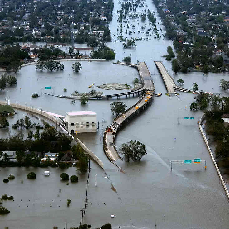
Top photo; Flooding in New Orleans after Hurricane Katrina in 2005. More than 1,800 people died in this event. (Photo by AP Photo/U.S. Coast Guard, Petty Officer 2nd Class Kyle Niemi in Wikipedia).
Bottom photo: By Buonasera – Rechteinhaber und eigenes Foto (Wikipedia).