Dr Jennifer Marohasy is an Australia biologist who has become a prominent writer about climate change. Her work forms the basis of some of Craig Kelly’s statements about climate change, especially about changes to BoM temperature records.
On this page I analyse some of her claims and the evidence she uses to support those claims. I find her work to be surprisingly unreliable.
Brief bio
Jennifer Marohasy grew up in Northern Territory and Queensland, and completed a BSc degree in Botany and Entomology at the University of Queensland. After some fieldwork overseas developing biological controls of weeds, she returned to complete a PhD in biology at the same university.
Since then she has worked for a number of organisations in several different lines of work:
- environmental manager for the Queensland Canegrowers Association, where she began an interest in the environment of the Great Barrier Reef;
- two stints at the Institute of Public Affairs (IPA), a right wing think tank, working on River Murray environmental issues including salinity, and as Senior Fellow working in climate change, which is her current position; and
- at Central Queensland University working on the Great Barrier Reef and medium-term rainfall forecasting using artificial intelligence/machine learning.
In much of her work, Dr Marohasy has challenged the consensus view on issues such as Barrier Reef degradation, Murray River environmental management and anthropogenic global warming.
In the following assessment, I will only be reviewing her views on climate change. Dr Marohasy’s publications on climate change include:
- numerous blog posts;
- a score of papers on rain forecasting and temperature analysis using neural networks;
- many articles for the IPA (2003-2008 and 2014-2020);
- articles in print and online news media;
- a peer reviewed paper on climate science: The application of machine learning for evaluating anthropogenic versus natural climate change;
- she edited two books on climate science produced by the IPA, the most recent released in 2020.
It appears that her positions at the Institute of Public Affairs (a conservative think tank and lobby group) and Central Queensland University were significantly funded from fossil fuel interests. She has also been associated (at conferences and in publications) with climate sceptics including the Heartland Institute and Tony Heller.
Dr Marohasy and climate change
Dr Marohasy has good scientific credentials (though not in climate science), and her papers and other material are well-written. To assess her work, I have compared her arguments with those of climate experts on these important topics:
- Adjustments to BoM temperature data.
- Assessment of the 2019/20 summer bushfires.
- Anthropogenic versus natural climate change.
1. Adjustments to BoM temperature data
Temperature records in Australia commenced about 150 years ago, with some readings before that. However these 19th century readings weren’t well organised and weren’t recorded consistently. Temperature records are especially vulnerable to local variations, for example, exposure to the wind and direct sunlight, and the nearby location (or not) of heat sources such as paved areas or brick walls.
The recording of temperature, as for other meteorological data, has changed and improved since then.
- About 1910 Stevenson Screens became standard. These shield the thermometer from direct sunlight and so more accurately record the ambient air temperature.
- Over time, siting requirements were also standardised. The location of early weather stations was often limited by the need to be convenient for a manual reader. Stations were sometimes moved because of changes to the location , for example, growth of trees or construction of buildings.
- The most common measuring equipment has been the “liquid-in-glass” thermometer, but electrical resistance temperature probes are now also used.
- In the past, some stations were read only twice a day while others had 8 readings per day. More recently, recording is more or less continuous. With temperature varying diurnally, the number and timing of readings obviously may affect the maxima, minima and averages recorded.
All of these factors, plus human error, can affect the temperature actually recorded and introduce inconsistencies into the record. Random errors will give a reasonably accurate average result, but systematic errors (most of the above) will introduce a consistent error – absolute values will be in error though trends may not be affected. Good procedures, training and quality assurance are ways to try to reduce errors.
The Bureau has developed a long term reference network of climate stations, known as ACORN-SAT (Australian Climate Observations Reference Network – Surface Air Temperature). This has required filling of gaps in some station records, records to be extended, and adjustments made to make each record consistent. Original readings are always retained and are available to the public.
Average temperatures are calculated as the average between the daily maximum and daily minimum.
Dr Marohasy’s challenge to the Bureau of Meteorology
In a series of papers and articles over the past decade, Dr Marohasy challenged the BoM procedures and temperature records. Her challenge has been two-fold:
1. Different measuring equipment
She argues that the changeover from liquid-in-glass thermometers to electronic probes has led to higher maximum temperatures being recorded in recent years. This is because the older thermometers were slower to respond and so missed some short-term fluctuations that are picked up by the probes which measure every second. She says the normal standard method requires the 1 second readings to be averaged over a minute to calculate the “instantaneous” maximum, but BoM doesn’t do this. But she offers no data to support this contention.
2. Changes to records
Because of the changes in station location and methods of recording, the ACORN-SAT often required data to be extended or infilled as noted above, and “homogenised” to eliminate inconsistencies introduced. Dr Marohasy argues that BoM has not done this properly and has introduced bias and error into the available datasets. In some cases, she says, older data has simply been removed from the record.
Her accusations and conclusions
All this, she says, allows the BoM to change records which show a cooling trend to appear as a warming trend. At times, she has also accused BoM and its officers of “corruption“, deliberately making unjustified changes to support a global warming agenda and “taking a revisionist approach to history“. In one case at least she uses the word “fraudulent”.
“No conclusion regarding global warming can therefore be drawn before these matters are settled.” she has said.
Bureau of Meteorology response
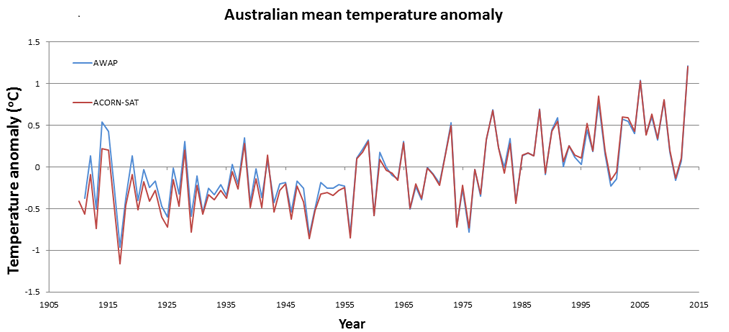
BoM asserts that its data management, including homogenisation, has been peer reviewed by international experts, who have concluded that its practices are among the best in the world. This webpage and this paper provide some information on the BoM processes.
BoM points out that the differences between the non-homogenised record and the homogenised data are minor, and both datasets show a clear warming trend (see graph).
Assessment
I have extensive experience in the collection, checking and adjustment of streamflow and rainfall records. While these records have different problems to temperature records, many of the same principles apply. So I can say with assurance that virtually all long term meteorological and hydrological datasets contain errors and inconsistencies. Human error includes wrongly recorded readings, changes to equipment and location that aren’t correctly recorded, missing record and more.
It is unsurprising that BoM temperature data requires correction, estimation of missing records and homogenisation. Simply pointing this out says nothing about the integrity of the final record. In reality, not adjusting the records would in most cases be much more misleading than making the adjustments.
But the original records are never over-written. They are primary information and can always be used to re-assess any adjustments.
1. Different measuring equipment
Dr Marohasy has examined the differences in the records of modern electronic probes compared to conventional thermometers means, and says that the probes capture higher maxima and lower minima than the older thermometers, thus biasing the record and making recent maximum temperatures seem hotter. (Not sure if she thinks the minima are now colder.)
I wrote to BoM about this issue and was referred to two papers (a paper in the Journal of the Royal Meteorological Society and a BoM report). Unsurprisingly, BoM had realised this might be an issue, investigated it using parallel records at 6 locations, and before and after records at more than twenty locations.
Both checks gave similar results. There were differences between the different instrumentation, but:
- the differences were within the accuracy limits of the equipment,
- the differences weren’t systematic, but apparently random,
- there was a slight tendency for the new instrumentation to give lower temperatures (the opposite of what Dr Marohasy alleges), and
- these errors made an insignificant difference overall, and didn’t require any adjustment.
It is clear that Dr Marohasy was wrong in her assertions, and her arguments reflect poorly on her. Either she didn’t check the BoM’s data analysis (which is poor methodology) or she knew about the reports but didn’t mention them because they showed her contention was wrong (which is deliberately misleading).
2. Changes to records
I have assessed Dr Marohasy’s claims by examining her analysis of several alleged problems.
Wagga Wagga
In a February 2020 blog post, Dr Marohasy says BoM staff “remodel all the historical temperature data generating trends and statistics that look quite different from the actual measurements” and infers deliberate deception where data are “reworked to further increase the rate of warming”. She uses a graph (below) of maximum temperatures at Wagga Wagga as an illustration. Her accusation isn’t specific, but she infers that (1) the 1910-1950 raw data (shown in green) should have been used but has been adjusted to show warming (the red and orange lines below the green), and (2) the ACORN dataset (BoM’s adjusted data used in climate modelling) was changed to show increased warming.
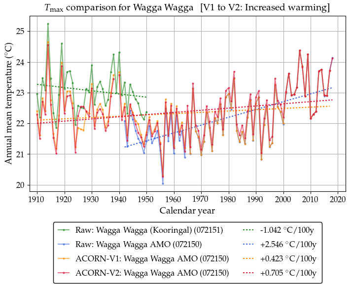
Unfortunately for her, this graph illustrates that BoM has correctly adjusted the inconsistencies at Wagga. There have been two sites at Wagga and they ran concurrently for 9-10 years. Analysis of the common period shows that and the earlier one (Kooringal, shown in green) consistently recorded annual maximum temperatures about a degree higher than the current site – you can see that in the period 1942-1950. Using this excellent correlation allows the temperatures at the current site to be estimated for the earlier period, producing a consistent long term record. (You can see all the graphs on the Open Mind blog.) So the Wagga Wagga figures in ACORN-SAT weren’t adjusted down, they were estimated from the other station.
This example clearly shows Dr Marohasy’s “analysis” in a poor light. She appears not to understand that this is a case of extending the record via correlation with a nearby station. She chooses to combine the two station records, which is bad practice because it creates an inconsistent record. She appears not to understand this.
Rutherglen
Dr Marohasy has analysed the temperature data for Rutherglen in Victoria and shown that the raw minimum temperature data has a slight downward trend while the homogenised data has a stronger upward trend. The change is based on a 0.5 to 1.5°C downward adjustment to temperature readings before 1975. She is particularly critical of 5.4°C downward adjustment to the maximum temperature during the hot 1938/39 summer.
Dr Marohasy argues that the raw data was more reliable, and the downward trend in the raw data correctly reflects changes in landuse which can affect air temperature. She says adjusting temperatures like this “may once have been considered fraudulent”.
Dr Marohasy’s paper supplies scant reasons to suspect the adjusted dataset is wrong, and there are good reasons to think it is her conclusions that are mistaken.
- BoM says the station location has changed, necessitating adjustment similar to the one required for Wagga Wagga. She says there is no evidence in the station record of a change in location. But undocumented changes are not unknown, so BoM’s assessment should be accepted.
- She says she can’t find any breakpoints in the raw data to indicate a change in location. However independent data analysis on the Open Mind blog shows 4 break points, apparently at roughly the same times as the adjustments by BoM. Again, BoM seems to have done its work well.
- Some of her Rutherglen analysis of hot summers only uses the period up until 2016. She justifies this by saying she is only using the mercury thermometer data, but the suspicion remains that this allows her to ignore the hot period 2016-2020, including the hottest year on record, 2019. Including the later years would change the result.
- I’ve been unable to check her claim that the high January 1939 temperature has been wrongly adjusted down. But I do notice that (1) she offers no evidence to show BoM is wrong and (2) nearby stations can differ by more than 5°C on hot days, so moving a station could require that much of an adjustment. In any case, the alteration of one hot day makes virtually no difference to the trend.
I conclude that her Rutherglen example offers little evidence of wrong adjustment by BoM. Her accusations haven’t been backed up by factual information, but rather by ignoring recent data. She doesn’t seem to understand that moving a station can create a totally new record, and these two different datasets cannot properly be combined as she does.
I haven’t checked similar criticisms that have been made about the temperature records at Bourke, Amberley and Albany (and maybe more) but the Rutherglen example suggests her analysis at those sites is likely based on the same inadequate methods.
Not using some data
Some parts of the records at many stations (e.g. Bourke, Wilcannia, Oodnadatta) are not included in the ACORN-SAT data set, because BoM considers that the data collection was non-standard and unreliable. Dr Marohasy criticises this without showing that the record is accurate (something that would be very difficult to show).
So in the end, highlighting these omissions can sound suspicious to someone unfamiliar with temperature recording in Australia, but BoM’s principles are sound.
Conclusion
Dr Marohasy’s analysis of temperature records is at best inadequate and at worst totally mistaken. She appears to be unaware of several key principles of data collection, she makes many unsupported assertions and accusations, she carefully chooses only the data that can be made to appear to be erroneous, and she has not shown significant mistakes on BoM’s part.
2. Assessment of last summer’s bushfires
In two articles (It has been hotter, fires have burnt larger areas and Climate Change The Facts) Dr Marohasy opposed any connection between climate and the disastrous 2019/2020 bushfires. She argues that there have been worse fires and worse weather in the past. I have examined the following specific claims:
- Larger areas have been burnt in previous fires (she specifically mentions fires in 1939, 1951/52 and 2009).
- Previous fires have been as ferocious.
- It has been hotter previously in south-eastern Australia.
- Rainfall isn’t declining in south-eastern Australia.
Larger areas have been burnt in previous fires?
The best figures I can find for areas burnt (see Table) show that Dr Mahorasy is incorrect. None of the fires she mentioned burnt more than the 2019/20 fires (she appears to have compared the NSW area for 2019/20 with the Australian area for1951/52.)
| Year | Location | NSW | Australia |
| 1939 | NSW & Victoria | 2 (a) | |
| 1951/52 | Queensland, NSW & Victoria | 4.5 (b) | 8 (c) |
| 1974/75 | Central Australia | 3-5-4.5 (h) | 100 (d) |
| 1993/94 | NSW | 0.8 (e) | |
| 2006/7 | Victoria | 1.2 (a) | |
| 2009 | Primarily Victoria, also NSW | 0.4 (a) | |
| 2019/20 | All states, primarily NSW, Victoria & NT | 5.5 (f) | 24 (g) |
The only fires larger than 2019/20 (that I can find) were fires in Central Australia in 1974/75. But these fires burnt only grasslands, with much less impact on property and native animals. The 2019/20 fires are considered to have been severe because:
- Almost 20% of Australia’s eucalyptus forest was burnt, possibly the largest ever recorded.
- They included the largest ever forest fire in Australia, the Gospers Mountain fire, which burned for 79 days and burnt out over a million hectares.
Previous fires have been as ferocious?
Dr Marohasy offers no evidence for this claim, and it is almost certainly wrong. It is true that previous fires have killed more people directly (e.g. the 2009 Black Saturday fires in Victoria killed 173 people – indirect smoke-related deaths weren’t recorded), but the number of deaths relate more to whether fires occur near towns, the quality of warnings and advice, whether residents choose to stay or flee, etc, and not ferocity alone
There is no clear measure of ferocity, but the following suggest that the 2019/20 fires were the most ferocious since European settlement:
- Permanently wet forests burnt for the first time.
- The Forest Fire Danger Index was the highest it has ever been (since 1950).
- Firefighters reported again and again that these fires were “unprecedented”.
- Meteorologists reported an increase in the phenomenon of extremely hot fires producing pyro cumulonimbus clouds and dry lighting.
- There was an enormous loss of wildlife (possibly a billion animals) and biodiveristy.
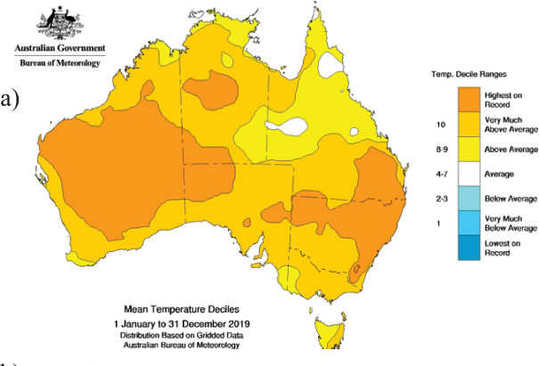
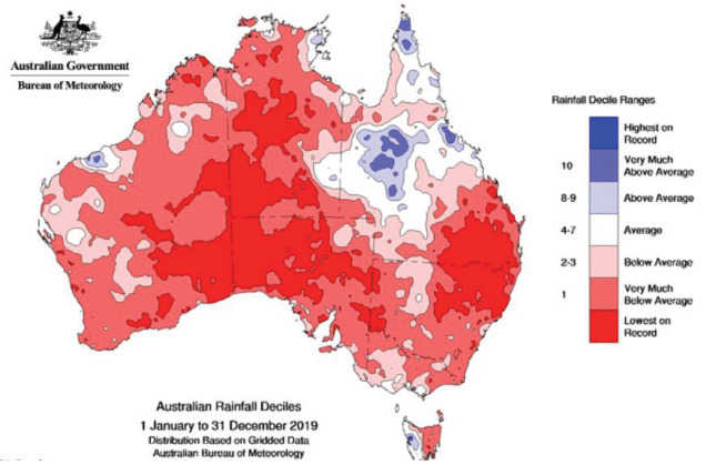
It has been hotter previously in south-eastern Australia?
2019 was the hottest year on record for Australia. As the map shows, record high temperatures were experienced in the coastal areas from southern Queensland to northern Victoria – this covers the major fires areas. Dr Marohasy uses her own version of the temperatures at Rutherglen, west of Albury, to justify her temperature claim, but this is problematic for two reasons:
- Rutherglen is a long way from the main fire areas and is just one station.
- The statement is based on her contentious claims about BoM records being wrong, which, as we have seen, is a biased conclusion based on faulty data and faulty reasoning. In her blog post, her graph doesn’t even show the period since 1998, thus missing all the hottest years on record.
It is reasonable to say Dr Marohasy is wrong about temperatures in the worst fire areas. Record high temperatures were experienced in 2019.
Rainfall isn’t declining in south-eastern Australia?
The map shows that record low rainfall was experienced in northern NSW and southern Queensland, while the rainfall in southern NSW and north-eastern Victoria was in the lowest 10% of recorded rainfall, but not the lowest ever.
Rainfall records for 6 locations near the Gospers Mountain (northwest of Sydney) and Currowan (NSW south coast) fires all show a slight downwards trend over the past 60 years. (The graph below shows Bilpin, which was on the edge of the Gospers Mountain fire.)
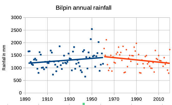
However these trends are not statistically significant, and the data can reasonably be interpreted as showing no change in the rainfall pattern. It will be some years before any trend could be established.
Dr Marohasy therefore appears to be correct in saying that there is no evidence of a decline in rainfall in southeast Australia. Nevertheless, the warmer weather made conditions drier, as indicated by the Forest Fire Danger Index.
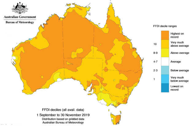
The Forest Fire Danger Index (FFDI)
The dryness of the fuel isn’t just dependent on rainfall. The Forest Fire Danger Index combines information on rainfall, evaporation, wind speed, temperature and humidity. As the map below shows, it was at record danger levels for much of the east coast in the Spring of 2019 leading up to the fires and was in the upper decile elsewhere.
This demonstrates that fire conditions really were worse in the 2019-20 summer than ever before recorded.
Conclusion
Dr Marohasy’s assertions about the 2019/20 bushfires are mostly unjustified. These were Australia’s most ferocious bushfires on record, and the warming and drying of the climate in south-eastern Australia (as measured by the FFDI) really did have an impact.
On a more positive note, most experts agree with her that managing fuel load can be improved, and learning more about indigenous fire management may assist in this.
3. Anthropogenic versus natural climate change
Dr Marohasy has taken an interest in whether temperature rises in recent decades have been caused by the release of greenhouse gases as believed by climate scientists, or are mostly natural.
Most climate analysis and prediction is built on computer models of complex physical processes (General Circulation Models). They require heaps of data and sophisticated modelling techniques. Another approach has been investigated, described as “machine learning” or “artificial neural networks“. These fancy terms describe a process which in some ways mimics how the human brain works. Instead of a computer being programmed to do a certain task (e.g. via equations), it is given examples and allowed to develop its own way of categorising or analysing the information.
Dr Marohasy and Dr John Abbot have used machine learning approaches to successfully predict short term rainfall and temperature. So in a 2017 paper they applied similar approaches to analysing whether current global temperatures are the result of human activity, or can be seen as mostly natural.
Long term temperature records (known as “proxies”) have been reconstructed from tree rings, coral cores, etc, for periods up to 2,000 years. Abbott & Marohasy used machine learning to analyse and model the natural cycles and patterns of temperature change in proxy records at 6 locations, for the period up until the industrial revolution (1830). Then they used the outcomes to predict the proxies for the remaining period when warming has increased.
Their claims
Abbot and Marohasy claim that their method predicts the proxy temperatures well, from which they conclude:
- Current temperatures are no higher than a warm period in medieval times, and so not exceptional.
- “we cannot confirm that recent warming is anything but natural – what might have occurred anyway, even if there was no industrial revolution.” (Marohasy, August 2017)
- Increased atmospheric carbon dioxide has a much smaller impact that commonly thought.
- Their paper wasn’t judged on its merits because current science has invested heavily in physical models, and is wary of machine learning approaches.
Their critics
Their paper hasn’t been well received, with numerous criticisms.
The main criticism is that their method is purely based on mathematics, with no physical parameters at all. Thus it relies on the assumption that long term temperature follows mathematical patterns or cycles that can be predicted without any physical data.
But, the experts say, the physical world cannot be reduced to mathematics. Temperatures vary with such physical factors as solar radiation, the amount of heat discharged back into space (which depends on the composition of the atmosphere), and volcanoes and the ash they put into the atmosphere. The Abbot/Marohasy approach assumes the future will follow the same mathematical patterns as the past, which isn’t true.
This criticism is reinforced by the fact that many other machine learning climate models (including the earlier ones developed by Abbot and Marohasy) all use physical parameters, albeit simpler than in the General Circulation Models, and then use machine learning to improve the model outputs.
Other apparent problems with the approach:
- They don’t test their model against actual recorded temperatures, but only against the proxies.
- Their model time scale is in error by 35 years, so they miss most of the recent warming. (I must admit I was unsure of this criticism.)
- The proxy records all finished between 1950 and 2000, before the most recent warming occurred, and so don’t show the Abbott/Marohasy approach can predict the worst of the warming.
- There are many proxy temperature records that could have been used. No explanation is given why these 6 were chosen, leaving the suspicion that the ones giving the “best” results were used.
- Neural networks are a black box and successive iterations can be run until a suitable answer is produced.
- In the past, local temperature variations tended to cancel each other out, so global variation was about a tenth of the local variation. But nowadays temperatures are rising all over the world, so local temperatures are reinforcing, significantly increasing global temperatures. Abbot and Marohasy’s method misses this, which explains why they miss the recent temperature rise.
Assessment
I have no expertise in these matters, but the criticisms seem to me to be devastating. The paper isn’t good science and it doesn’t establish what it claims.
Neither Dr Abbot nor Dr Marohasy are qualified in climate science or machine learning, and it seems they fall into error in both aspects. Machine learning can be a useful adjunct to physical models, but not if used in this way.
Conclusion
I was expecting an informed analysis of data from Dr Marohasy. But this review has shown her climate work can be criticised on a number of grounds:
- Not offering evidence for statements (e.g. the problems with temperature probes; the ferocity of recent bushfires).
- Stating facts and inferring fault without showing fault (e.g. the fact the BoM adjusts or omits some records from the ACORN-SAT dataset).
- Use of inaccurate data (e.g. areas burnt in bushfires).
- Not using all the data, without justifying the reasons (e.g. the omission of recent temperature data in the Rutherglen analysis; the assessment of temperatures in the recent bushfires; the machine learning paper).
- Not referring to BoM reports that refute her claims (e.g. changes in temperature recording equipment).
- Inaccurate analysis (e.g. combining the records of two stations at Wagga; using machine learning without physical parameters in assessing temperature trends).
- Drawing conclusions from isolated examples while ignoring the clear trends in the full set of data.
These faults lead a number of reviewers to conclude her analysis is unreliable.
It appears that some of Dr Marohasy’s critiques of BoM data have led to the Bureau refining its approach, and this is helpful. But mostly her criticisms have little substance because of the poor quality of her analysis. BoM has a very good reputation for the quality of its work. For example this reviewer says:
“The BoM has, in my opinion, assembled the best national temperature data in the world because they use the most advanced methods to correct for known problems ….. Few people appreciate just how advanced are the methods that the BoM uses to homogenize data, or how many tests and critiques it has withstood. When I say that in my opinion theirs is the most advanced in the world, I base that on years of experience as a scientist and statistician, and on close examination of the methods used by many organizations.”
Up against such expertise, she is often left with conspiratorial claims that have no demonstrable basis or credibility.
Even if her claims about BoM were true, the overall global and Australian data clearly show a definite warming trend. Yet she and others use her critiques to unjustifiably infer there is doubt about the warming trend and climate science. The identification of minor errors, even if true, can be a smokescreen to hide the larger reality.
Critics suggest her poor analysis and unjustified conclusions result from determined opposition to the science of global warming and action on climate change. It is hard not to agree.
I conclude that none of her conclusions can be accepted without extensive checking against data using correct scientific and statistical methods.
If I can be shown to have made errors in my assessment, I am happy to make changes. I don’t wish to be unfair to Dr Marohasy.
References
- Jennifer Marohasy website. Publications listed on the website.
- Jennifer Marohasy, Senior Fellow, Institute of Public Affairs. Jennifer Marohasy’s Top Ten Hits on the Bureau of Meteorology on the IPA website.
- Jennifer Marohasy. Wikipedia.
- Jennifer Marohasy. Desmog.
- Long-term temperature record. BoM.
- Climate Data Online. BoM.
- Critiques of Dr Marohasy and IPA:
- How Australia’s ‘fever swamp’ of climate science denial is pushing a non-scandal about temperatures. Graham Readfearn, Renew Economy 2017.
- Cult of Stupidity: Naming Names. Open Mind blog, 2020.
- How one think tank poisoned Australia’s climate debate. Kishnor Napier-Raman, Crikey.com.
References on bushfire areas burnt
(a) Forest Fire Management Victoria.
(b) Australian Institute for Disaster Resilience.
(c) CSIRO report, 1976.
(d) Australian Academy of Science.
(e) Wikipedia.
(f) Science Direct.
(g) Royal Commission. Earlier reports said 18 million ha. Nature says 30-40.
(h) Guardian.
Photo: Dr Jennifer Marohasy, taken from her website. (I understand that use of a publicly available photo as part of a critique is considered fair dealing. If anyone thinks otherwise, please let me know.)